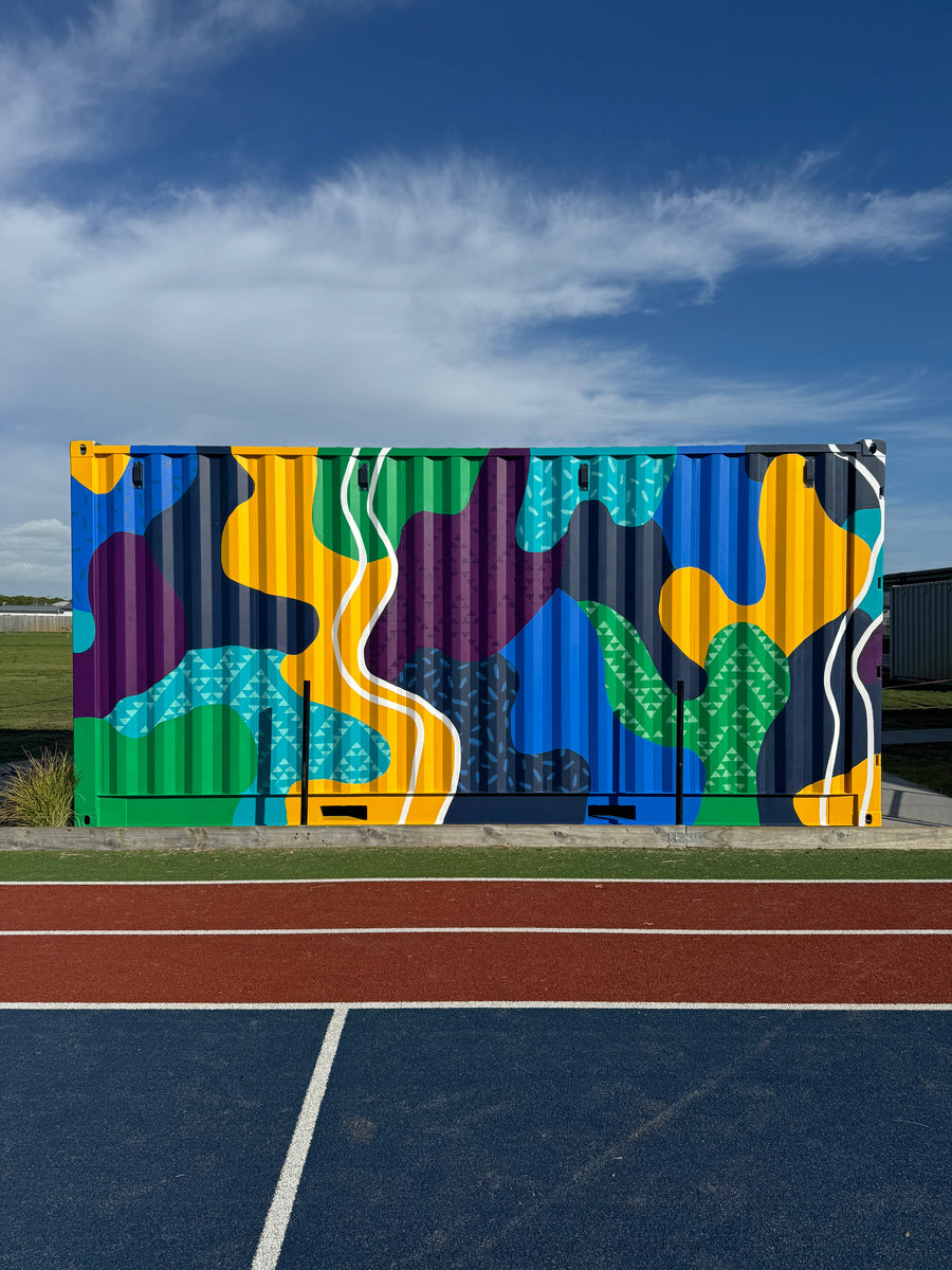
This mural was an incredible opportunity to bring the heart of Papamoa Primary School to life through colour, symbolism and storytelling. The backbone of the design is inspired by the four Pou (or school houses). I also drew inspiration from the school values: weaving together elements of Commitment, Care and Connection, through flowing shapes and a strong colour palette.
The main colours are pulled from the existing Pou colours, with an addition of blue, navy and white. The white elements act as a bridge, harmonizing the composition and reinforcing the idea of connection.
Each part of the design holds meaning:
The curved, abstract shapes represent Commitment – each unique and distinct, symbolizing the individuality of every student and their learning journey. As they come together, they create a cohesive whole, echoing the school’s belief in resilience and adaptability: “We keep trying and are willing to adapt to change.”
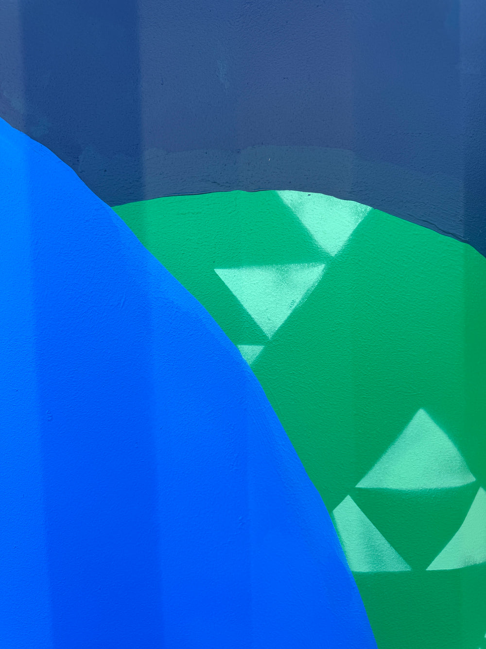
The scattered sprinkles pattern reflects Manaakitanga (Care) – a reminder of the students' consideration for one another and their environment.
The Niho Taniwha (Teeth of the Taniwha) pattern pays tribute to Pāpāmoa’s maunga, grounding the mural in its local identity.
And finally, the white lines represent Whanaungatanga (Connectedness), symbolizing pathways, relationships, and the journey of learning. This element acknowledges the school’s dedication to respecting the past, living in the present, and building a future for the next generation.
Creating this mural was an absolute joy, and I loved the challenge of translating these important values into a bold, abstract design that feels both meaningful and energizing.
💙 Special thanks to Papamoa Primary School for trusting me with this project and to Linda Munn, whose original Pou designs laid the foundation for this visual storytelling and I am honoured to have had permission to replicate her Pou designs within the mural.